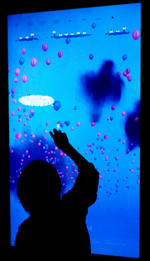
 Jonathan Harris and Sep Kamvar currently have a fascinating visualization up at NYC’s Museum of Modern Art called “I Want You To Want Me.” This beautiful video showcases the piece and its various movements. In short, they’ve taken profile content from online dating sites and used it to construct an image of humanity through their tastes, desires, self-descriptions, and ideas about the world. This is an interactive visualization on a touch-screen, allowing viewers to navigate through people’s self-expressions, all represented as bubbles with people trapped inside. The piece is currently on display at the MOMA and will be until May 12. If you get to check it out, tell me what it’s like to play with it since I’ll only get to see the video. (Silly dissertation.)
I love that Harris and Kamvar use dating material to reflect society. I think that such expressions of intimacy are perfect for getting at the diversity and commonality of humanity. This also makes me think of Golan Levin, Kamal Nigam, and Jonathan Feinberg’s The Dumpster which is an interactive visualization of the romantic breakups of American teenagers as seen through their blogs.
I’m in awe of all of these artists and their ability to create such engaging interactive visualizations of social data. Yummy tasty goodness.

that is a brilliant idea — thanks for the link. Now I just need to get to NYC…
very interesting and sweet. thanks for posting!
That’s awesome, it’s nice to know that there’s people who can represent art with current technological innovations. This to me seems like a true art form where truly, all five senses are immersed.
Jamie
… I need… you… to need me… 🙂 Thanks for the heads up!
I am an enormous Jonathan Harris and was just so over the top excited when I came across this piece at MOMA. It is every bit as cool as it looks. Jonathan Harris’ work always succeed to show that the internet is a web of people. The tactile interface of this piece makes it even more human.
The sound, colours and design of the thing are just perfect, and the idea of mining dating sites inspired. Get to see it, you will not be disappointed.
This is a great project. I became a huge fan of Jonathan Harris after watching his talk at TED last spring, and was thrilled to see this show at MoMA.
The artist statement on the project website describes the piece nicely. In the gallery, the touchscreen presentation is in a kind of dark corner, casts a really warm glow, and has a great sound setup, so interacting with it is an encompassing experience. It’s gorgeous and romantic.
It was fun to watch people hesitate to touch a piece of art in a museum, and to see strangers interact with it together. I think Stars wrote the audio track specifically for this project and it’s perfect.
Nice presentation tonight. Y’all talk so fast though
Your blog is great!
The visualization at the MOMA is beautiful and heart-warming. Thank you for sharing.
Thank you for the the link.
I enjoyed it.
So, as a user of online dating sites, the exhibit/piece seems lonely both in placement an in generated emotion. The process of searching and clicking is not one that ultimately connects to anything. It generates a sort of dead-end emotion – exhausted hope.
And while I haven’t been to see the piece, and while they use happy balloons to represent people, I think I would find it incredibly sad in a sort of “water water everywhere but not a drop to drink” way.
Sort of as a response to Hapto’s comment above– Clicking through lists of profiles on dating sites can quickly become demoralizing and tiring. However, when a piece like this one puts it into a giant visualization… well, it kind of offers a different perspective that makes you more of an observer than a participant.
To me, one of the most surprising and valuable aspects of social networks is how, when presented in a tangible and visual format such as this, you can really see how vibrant and alive the communities are. I think that this is a great subject to explore through art pieces. Thanks for writing on it– now I really need to go see it in person!