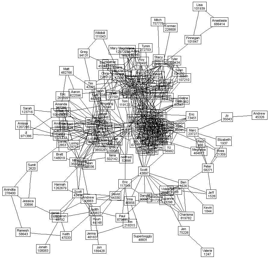
Continuing on my “Ben Discoe rocks” campaign, i was utterly ecstatic to receive an image of my own first degree Friendster network. When Ben visualized his own data, he was dealing with a relatively small network. My data is a little bit more out of hand as i have 150+ friends and many of them are in overlapping social circles. Thus, in order to make it remotely legible, Ben needed to remove me from the picture and concentrate on my friends’ relationships with each other.
Of course, there is nothing better than having a visualization of your own network behavior because you can tell the story about the relationships better than anyone. For example, there are three dominant clusters. The top one is a group of friends in San Francisco who are tightly knit. The lower chunk is a group of spiritual and religious friends in SF. The group to the left is Brown. Of course, there are interconnections between these groups and there are people who branch off from there. From the outer right and into the lower half (below the clusters) are a slew of various researchers that i know from social software and digital academia.
Of course, this story is probably just as meaningless to you (if you don’t know me) as it was before i told you. But for me, as the actor, these patterns are immensely meaningful and important. Not only do they remind me of why networks are beautiful but they reaffirm my feelings that there are some impressive clusters amidst this data that needs to be given credence.
Sadly, two degrees of my friends are just completely illegible using this software. Time to build my own view.

sweet!